
Control Area
Tabs
Selecting a menu item in the Control Center opens its respective menu and displays its control interface. The control interface has tabs located at the top of the page of most menus in the Control Center. An image of such tabs can be seen in the image below:
 A selected tab is highlighted in a dark blue color. |
Other places where such tabs can be found are in various dialogs of the Control Center.
Filter Headers
Many control interfaces have lists of items, such as a list of completed jobs. These lists can be filtered through the use of filters found in the header, which is displayed above a list. An example of a filter header is shown in the image below.

In this example, the filters found under the Completed jobs tab are shown, where filtering by Application, Jobtype,
Queues, Date from & Until, and Jobname is possible. Different filters will be available in the various menus of
the Control Center. Most filters are self explanatory, but additional explanation is given on the help
pages.
| If the AutoRefresh option is not enabled, the Refresh button needs to be used to refresh the list of items. |
Buttons
Actions can be performed through the use of buttons to, for example, refresh a list of items or view the details of a selected item. Some of the more common buttons are shown in the image below.

- Refresh: Refreshes the list of shown items.
- View: Views the details of the selected item in the list.
- Add: Adds a new item to the list.
- Edit: Edits the details of the selected item in the list.
- Copy: Copies the details of the selected item in the list to a newly created item in the list.
- Remove: Removes (deletes) the selected item in the list.
List Settings
If the Grid Settings button  is selected, the Grid Settings dialog shown in the image below will open. The visibility
and order of columns for the item list can be configured in this dialog.
is selected, the Grid Settings dialog shown in the image below will open. The visibility
and order of columns for the item list can be configured in this dialog.
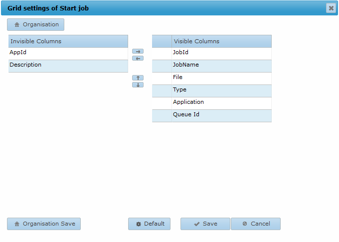
Columns can be moved from the left section (Invisible Columns) to the right section (Visible Columns) and vice versa with the left  and right
  arrow buttons to configure which columns are visible. The order of columns can
also be changed with the up
arrow buttons to configure which columns are visible. The order of columns can
also be changed with the up  and down
  arrow buttons.
- Selecting the Save button saves the current grid settings.
- Selecting the Default button button restores the default AMT Control Center grid settings.
- Selecting the Organisation Save button saves the current grid settings for the organisation. If a user then selects the Organisation button, the saved organisation settings will be loaded.
Item Lists
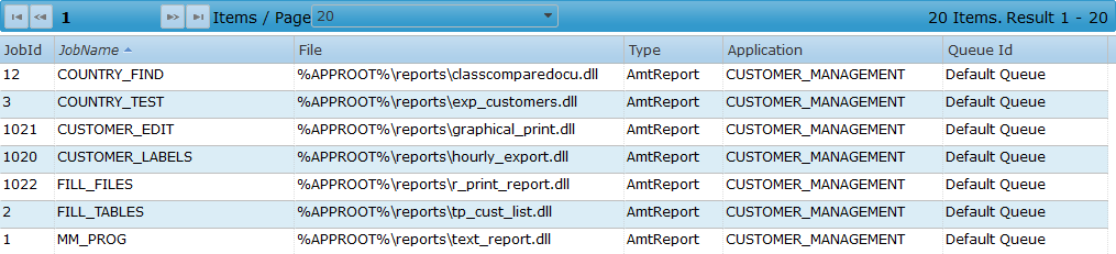
Many control interfaces will contain a list of items as shown in the image below. Each item can be selected, which enables the use of the buttons described earlier on this page. If an item is double clicked, the item will show its detailed information as if the View button was selected.
List Header
A list header can be found above the item list, in which you can browse through the pages and configure the amount of items shown per page.

Total number of items and range
The total number of items in the list can be found on the right side of the list header. Also shown is the currently displayed range of items on the page.
Items/Page
In the middle there is a drop-down menu to select the number of items that will be displayed per page. The available values are 5, 10, 20, 50, 100, 200 and 500 items per page.
Page navigation
On the left side of this header are the following buttons for navigation:
- Selecting the next
 or previous
  button will navigate the user to the next or previous page.
 - Selecting the last page
 or first page
  button will navigate the user to the last or first page.
 - Selecting an individual page number, such as
 , will navigate the user to that specific page.
Sorting
Sorting the contents of a column can be done by clicking the column header above the contents. An arrow will appear if sorting on that column is active as shown in the image below.

Selecting a column will sort the column and cycle through ascending and descending sorting.