Checkbox
Description:
Box control that can be toggled on (checked) or off (unchecked) at runtime. At designtime you can link certain actions to this item, depending on its status. In a group of checkboxes, a user can select more than one checkbox.
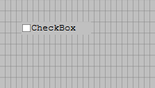 |
| A check box |
Toolbar button icon:

Properties:
- Caption
- Checked
- Color
- Decimals
- Description
- Dictionary
- Enabled
- Font
- Height
- HelpText
- Labelpos
- Left
- Length
- Name
- OccursData
- Parent
- TabNumber
- TabStop
- Top
- Type
- UnChecked
- UpperCase
- Visible
- Width
- ZOrder
Events:
Dynamic properties: