Layout Properties
| Property | Description | Set in | Value | ||||||||||
|---|---|---|---|---|---|---|---|---|---|---|---|---|---|
|
3D |
If set to True, the control is shown in 3D. |
Object inspector |
<Boolean> |
||||||||||
|
ActivePage |
The active tabsheet for a pagecontrol when sending the form. The property ActivePage can be set at runtime. Please note that the layout function 'Setfocus' has priority over ActivePage. |
Code |
<String> |
||||||||||
|
Align |
The position where the control appears. If set as "client", the control will use all available space. If set as "none", you can determine where the control will appear for your end-user. If multiple controls use the same align value, the controls will be placed on top of each other. |
Object inspector |
<None | client | bottom | top | left | right> |
||||||||||
|
Alignment (Static) |
Alignment for the text in the control. |
Object inspector |
<Left Justify | center justify | right justify> |
||||||||||
| Alignment (Dynamic) |
The alignment of labels for forms can be changed in the code definition. On graphical print layouts, the alignment of labels and memos can be changed in the code of the report. For the value of the alignment property, the system enumeration "SE-TextAlignment" should be used. Example: Lay_1.Display_1.Alignment := SE-TextAlignment.CenterJustify |
Code |
SE-TextAlignment.<CenterJustify | LeftJustify | RightJustify> |
||||||||||
|
Alt Shortcuts |
If set to True, "&" is automatically converted to a shortcut. When the user presses the ALT-shortcut, the cursor will be focused on the control that is defined with the property 'FocusControl'. |
Object inspector |
<Boolean> |
||||||||||
|
AutoHeight |
If set to True, then the height of the grid items is adjusted automatically when the font size changes. If set to False, the height of the grid items will not be affected when changing the font size. |
Object inspector, code |
<Boolean> |
||||||||||
|
AxisTextX |
Text to display on the X-axis |
Object inspector |
<Text> |
||||||||||
|
AxisTextY |
Text to display on the Y-axis |
Object inspector |
<Text> |
||||||||||
|
Bevel |
The borderstyle for the control that creates depth for the control. If the value is "none", the control appears flat. |
Object inspector |
<Lowered | none | raised> |
||||||||||
|
BorderStyle |
Borderstyle for the control to show. |
Object inspector |
<Single | underline | none> |
||||||||||
|
Caption |
Text to appear in the control. Some controls are divided into multiple items (such as records or columns) that each use a separate caption. Through the code separate items or elements can be set or read using the syntax "Caption []". Item captions in a single menu must always be unique. By adding an ampersand (&) before a character, that specific character will be marked as a shortcut character. At runtime, the concerned character will then appear underlined. Subsequently, the end-user can invoke the shortcut functionality through the keyboard combination Alt + <Underlined character>. If the concerned shortcut belongs to a label, it will shift the focus to the control that is defined through the property focuscontrol. If the concerned shortcut belongs to a menu control, it will trigger its OnMenuSelect event. At the time that a menu item is displayed on any level below the top bar, the Alt key does not need to be pressed in order to invoke the shortcut on that item. For menu controls, this property is also used to define a separator. If the menu item is intended to be a separator, its caption must be either a minus sign (-) or a pipe symbol (|). In this context (meaning that a separator is being defined), the caption property is not unique. The literal ASCII characters @0D@@0A@ (carriage return, line feed) can be used to make captions of alpha fields multi lined. See 'Assigning Literals to Alpha Fields' for more information on literal ASCII characters. |
Object inspector, code |
<Text> |
||||||||||
|
Caption [] |
The Caption property value for the controls item or element that is specified between brackets ([]), see 'Caption' above. |
Code |
<String> |
||||||||||
|
ChartKind |
Kind of chart to be displayed. |
Object inspector |
<Pie | line | bar> |
||||||||||
|
ChartMark |
Displays the chosen mark within the control. |
Object inspector |
<None | value | label | percentage | label+percentage | label+value> |
||||||||||
|
CharWidth |
Determines the space per character. This property does not change the character presentation, which means that characters are not stretched when choosing a higher property value. |
Object inspector |
<Numeric> |
||||||||||
|
Category |
The name of the category in which the concerned menu control is located (meaning the first menu item that is encountered when shifting from the menu item towards the root). If a pulldown menu item is concerned (meaning that it is defined at the highest level), the value for this property will be set to space (' '). In the object inspector, this property is readonly. Its value can therefore only be changed by shifting the menu item through the menu-editor. |
Object inspector |
<Text> |
||||||||||
|
Checked |
Value that is sent if the checkbox is checked. |
Object inspector |
<Text> |
||||||||||
|
CheckBoxes |
If set to True, checkboxes will be added to each item. |
Object inspector, code |
<Boolean> |
||||||||||
|
CheckBoxesEnabled |
If set to True, checkboxes on the control will be editable for end-users. If set to False, these checkboxes will be greyed out and disabled. This property only has meaning if the checkboxes property is set to True. |
Object inspector, code |
<Boolean> |
||||||||||
|
ClearAfterPrint |
If set to True, the label content will be cleared after printing. |
Object inspector |
<Boolean> |
||||||||||
|
ClearEmpty |
If set to True the mask in an empty Maskeditbox will only be displayed when the Maskeditbox is selected. | Object inspector | <Boolean> | ||||||||||
|
Color |
Background color to give to the control. This property can also be set for a whole form layout (including all available layout controls) at once. If <default> is chosen in the object inspector the color of the Parent layout control will be used If controls have multiple occurrences, you can use the syntax Control[<element>].Color to set or read each control element separately. In the object inspector it is also possible to open a colour picker window to select a custom colour by clicking on the "..." button to the right of the dropdown menu. 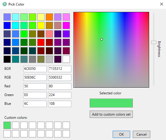 By adding a colour to the custom colors set, multiple custom colours can be quickly selected. |
Object inspector, code |
<Numeric BGR value> |
||||||||||
|
Color1..12 |
Color for the concerned series (which is indicated by the number). |
Code |
<Numeric> |
||||||||||
|
Color[] |
The Color property value for the controls item or element that is specified between brackets ([]) |
Code |
<Integer> |
||||||||||
|
ColorEdit |
Background color for the edit fields that are shown through the dynamic form which are not blinked or disabled. |
Object inspector |
<Numeric> |
||||||||||
|
ColorEditBlink |
Background color for the blinked edit fields that are shown through the dynamic form. |
Object inspector |
<Numeric> |
||||||||||
|
ColorEditDisabled |
Background color for the disabled edit fields that are shown through the dynamic form. |
Object inspector |
<Numeric> |
||||||||||
|
ColorEditFont |
Font color for the edit items that are shown through the dynamic form. |
Object inspector |
<Numeric> |
||||||||||
|
ColorEditReverse |
Background color for the edit items that are reversed. |
Object inspector |
<Numeric> |
||||||||||
|
ColorFontDisabled |
The font color that is used for the disabled (sub) items. |
Object inspector |
<Numeric> |
||||||||||
|
ColorFontSelected |
The font color that is used for the selected (sub) items. |
Object inspector |
<Numeric> |
||||||||||
|
ColorLabelBlink |
Color for the blinked label items that are shown through the dynamic form. |
Object inspector |
<Numeric> |
||||||||||
|
ColorLabelFont |
Color for the non-blinked label items that are shown through the dynamic form. |
Object inspector |
<Numeric> |
||||||||||
|
ColorLabelReverse |
Color for the label items that are reversed. |
Object inspector |
<Numeric> |
||||||||||
|
ColorSelected |
The background color that is used for the selected (sub) items. |
Object inspector |
<Numeric> |
||||||||||
|
ColorSeries1.. |
Color for the concerned series. |
Object inspector |
<Numeric> |
||||||||||
|
ColorShadow |
The color that is used to get the shadow effect. Together with the properties 3d, ColorShadowBright and ColorShadowDark, this setting effects the 3d visualization of a (sub) item. |
Object inspector |
<Numeric> |
||||||||||
|
ColorShadowBright |
The color that is used to get the shadow bright effect. Together with the properties 3d, ColorShadow, and ColorShadowDark, this setting effects the 3d visualization of a (sub) item. |
Object inspector |
<Numeric> |
||||||||||
|
ColorShadowDark |
The color that is used to get the shadow dark effect. Together with the properties 3d, ColorShadow and ColorShadowBright, this setting effects the 3d visualization of a (sub) item. |
Object inspector |
<Numeric> |
||||||||||
|
ColumnItems |
Definition of the columns that are shown in the listview. By clicking the button "***" on the right of the Column property field in the object inspector, the Column items dialog box is presented. Subsequently, the object inspector will display the properties for the listview column that is currently selected in the dialog box. This dialog box provides the following options:
When a column is selected in the dialog box, the properties for that specific item can be edited through the object inspector. The provided column properties are Caption, Alignment, Color and Width. If the color property is not set for a column then it will use the default, which is the color of the parent listview. |
Object inspector |
Settings for each separate column item. |
||||||||||
|
Columns |
The number of columns for the dynamic form. This value determines the width of the dynamic form. |
Object inspector |
<Numeric> |
||||||||||
|
COLUMNS[<Column number>].Caption |
The caption of the concerned column. |
Code |
<String> |
||||||||||
|
COLUMNS[<Column number>].Color |
Integer that indicates the color of the concerned column. |
Code |
<Integer> |
||||||||||
|
COLUMNS[<Column number>].ReadOnly |
If set to True, end-users are not allowed to write to the cells shown as editboxes inside the column or change the color of the text that is displayed in the column. If set to False, users have both read and write permission. |
Code | <Boolean> | ||||||||||
|
COLUMNS[<Column number>].Width |
Integer that indicates the width of the concerned column. |
Code |
<Integer> |
||||||||||
|
CursorY |
The vertical cursor position (line number) in a memo field. Example: MEMO_1.CURSORY := 99999999 // Positions the cursor on the last line in the memo field // (supposing that this field has a normal height). |
Code |
<Integer> |
||||||||||
|
DecimalChar |
Character that is used as separator in decimal values. |
Object inspector |
<Default | period | comma> |
||||||||||
|
Decimals |
Number of decimal characters to assign to the control value. |
Object inspector |
<Integer> |
||||||||||
|
Default |
Record that is selected as default. |
Object inspector |
<Integer> |
||||||||||
|
Description |
Description of the control. |
Object inspector |
<Text> |
||||||||||
|
Dictionary |
Dictionary in which the type, length and decimals are defined for controls that refer to this dictionary. See Global Dictionaries. |
Object inspector |
Name of the dictionary that applies to the control. |
||||||||||
|
DropDownCount |
Sets the number of lines shown when the combobox is opened. |
Object inspector |
<integer> | ||||||||||
| DropDownListSize |
If set to Combobox size, the drop down list has the same width as the combobox itself. This is the default behaviour. warning DropDownListSize is not supported in LionScreens. |
Object inspector | < Combobox size | Auto > | ||||||||||
|
Enabled |
Boolean value that indicates if the control or (sub) item is enabled. If set to False, the control or item will be greyed out and disabled at runtime. If controls have multiple occurrence, you can use the syntax "Control[<element>].Enabled" to set or read each control element separately. If used with a panel or groupbox the following is True:
|
Object inspector, code |
<Boolean> |
||||||||||
|
Enabled[] |
The Enabled property of a specific control item or element. |
Code |
<Boolean> |
||||||||||
|
Encrypted |
The Encrypted property of a specific control item or element. If set the transmission of data between
the Application Server and AMT Screens and/or the Web Client will be encrypted. If using multiple languages, this setting must be set to the same value across all languages per object. |
Object inspector | <Boolean> | ||||||||||
|
FileName |
The name of the image file that is displayed. At runtime, the specified file is expected in the directory "..\ClientGUI\Bitmaps". Therefore, please make sure you have copied the file to that location before unrolling the application. |
Object inspector, code |
<Gif- | jpg- | bmp-file name> |
||||||||||
|
FillColor |
Color for filling the painted shape control. This color will not be shown if the property 'transparent' has been set to True. |
Object inspector |
<Numeric> |
||||||||||
|
Floating |
If set to True, then the decimal sign will be printed. If not, this sign will be omitted. |
Object inspector |
<Default | True | False> |
||||||||||
|
FocusControl |
Name of the control that must be focussed when the user presses the ALT-Shortcut combination (according to the shortcut setting in the caption definition of the label). This setting only works at runtime if the property "Alt Shortcuts" is set to True. |
Object inspector |
<String> |
||||||||||
|
Font |
Name, style, size, effects, color and script for the font used in the control or the form. This property can also be set for a whole form layout (including the available layout controls) at once. warningThe fonts to choose from are the available fonts of the client machine the AMT Developer Studio is running on. When a chosen font is not available on the client machine AMT Screens is running on (for Reports the server the batch controller is running on and for the webclient the client machine the webbrowser is running on) the Windows default font of that client/server will be used. If that replacement font is wider then your desired font, field sizes will be expanded to fit. To add fonts, right-click on the font file and select the 'Install for all users' option under 'Show more options'. This will ensure that all AMT components will have access to the font. By clicking on the "..." button to the right of the colour dropdown menu, a colour picker window is opened where it is possible to select a custom colour. For more information, see the color property. Charts do not support italic, underlined, strikethrough or other special font styles except bold. |
Object inspector |
Values are chosen from the 'font box' that is called by clicking the button that is displayed on the right of the fontproperty in the object inspector. |
||||||||||
|
FontBold |
Determines whether or not the text (caption) in the control must be displayed in bold. |
Code |
<Boolean> |
||||||||||
|
FontColor |
The fontcolor for the control. For controls with multiple occurrence, this property can be set for each element separately by using the syntax "Fontcolor[]". |
Code |
<Numeric BGR value> |
||||||||||
|
FontColor[] |
The Fontcolor property value for the controls item or element that is specified between brackets ([]). |
Code |
<Numeric BGR value> |
||||||||||
|
FontItalic |
Determines whether or not the text (caption) in the control must be displayed italicized. |
Code |
<Boolean> |
||||||||||
|
FontName |
Name of the font that must be used for the text (caption) that is displayed in the control. |
Code |
<String> |
||||||||||
|
FontSize |
Size of the text (caption) that is displayed in the control. Note: In charts the size of the font can be controlled up to the point where it will no longer fit without overlap. When the size is set to large the size will be calculated automatically to fit. As a result the font size of the caption and labels etc. can differ. |
Code |
<Integer> |
||||||||||
|
FontUnderline |
Determines whether or not the text (caption) must be displayed underlined. |
Code |
<Boolean> |
||||||||||
|
Footing |
Text to display at the bottom of the control. |
Object inspector |
<Text> |
||||||||||
|
ForceDecimalKey |
If set to True, then values that are specified in the layout control will be rejected if they don't
contain the decimal character. If set to False, the decimals may be omitted. If set to none, values that contain a decimal character will be rejected. The last digits entered
will be used as decimals. If set to default, this option will work according to the global application setting. |
Object inspector |
<Default | True | False | none> |
||||||||||
|
Format |
Specification of how variables are to be displayed/printed. This property is equal to the format option for Local Definitions. See Format characters for a list of characters with special meaning inside format specifications. |
Object inspector |
<Format specification> |
||||||||||
|
FrameHeight |
The height of the selected print layout in Graphical Reports (in pixels). Example: var If (lay.frameheight + lay.frameheight < pageheight - 300) warning Frameheight can not be sent through SME |
Object inspector, code | <Integer> | ||||||||||
|
GridLines |
If set to True, grid lines will be shown in the Listview or Datagrid. |
Object inspector, code |
<Boolean> |
||||||||||
|
HasFile |
Indicates if a file has been loaded into the 'File uploader' control. If True, a file as been loaded and is able to be uploaded by using the 'Save' Function. This property is "Readonly". |
Code | <Boolean> | ||||||||||
|
Height |
Height of the control, form or popup form. Note: If the control is a Combobox and the Style is not set to Simple, the height of the Combobox will be controlled by the size of the used font and not by the value of this property. The height of the object can only be set to a number from 1 to the Maximum Height. |
Object inspector |
<Integer> |
||||||||||
|
HelpText |
Text to appear as a hint for the control that is displayed on the cursors position. |
Object inspector, code |
<String> |
||||||||||
|
HyperColor |
Color to be used for hyperlinks. This property applies to all layout controls that are available on a form. |
Object inspector |
<Numeric> |
||||||||||
|
HyperLink |
The URL of a web address or the location to a file or executable. warning Opening a file or executable only works in AMT Screens. Clicking the layout control (a button, image, or label) with a defined HyperLink triggers the action to do the following:
The URLs must start with either http:// or https://. |
Object inspector, code |
<URL String> |
||||||||||
|
ImageIndex |
Index number that points to a specific image in the imagelist. Through the object inspector, the ImageList and ImageIndex are selected from a dialog. Example: image_0.imageindex := 3 warning If the ImageIndex is used in the code, the full imagelist needs to be generated one time. This is applicable for newly created imagelists. |
Object inspector, code |
<Integer> |
||||||||||
|
ImageList |
Imagelist object that contains the image(s) to be shown in the layout control. Images from the imagelist can be set or read dynamically through a specific control element by referring to "Items[<Item index number>].Image index" in the code. Depending on the used control, an image may also be picked through the ImageIndex property in the Object inspector. If that control uses multiple occurrence, then each element will be filled with the selected image. |
Object inspector |
<Image list specification> |
||||||||||
|
IncludeLiterals |
If set to True in a Maskeditbox the returned value will include also the defined separator characters in the mask. If False, only the input characters will be returned. |
Object inspector |
<Boolean> |
||||||||||
|
InitialText |
Default text/value that is assigned to a memo control. |
Object inspector |
<String> |
||||||||||
|
InitialValue |
Default value that is assigned to the control. |
Object inspector |
<String> |
||||||||||
|
Interval |
The interval, in seconds, of a timer object to pass before a timeout occurs. |
Object inspector, code |
<Integer> |
||||||||||
|
ItemHeight |
Height of the separate grid items. This property only has meaning if the AutoHeight property is set to False. |
Object inspector |
<Integer> |
||||||||||
|
Items |
Items to be shown within the layout control. |
Object inspector, code |
<Text> |
||||||||||
|
Items[<Item index number>].Category |
The category property value for the concerned menu item. It is not possible to change the setting for this property for separators (which use the caption "-" or "|"). If the value is set to "" (empty), this implies that the menu item is presented on the top menu bar (highest level). |
Code |
<String> |
||||||||||
|
Items[<Item index number>].Checked |
Boolean value that indicates whether the checkbox for the concerned item is currently checked. |
Code |
<Boolean> |
||||||||||
|
Items[<Item index number>].Color |
In a Listview this property sets the color of the row with the given item index number. |
Code |
<Integer> |
||||||||||
|
Items[<Item index number>].Colors[<Column number>] |
In a Listview this property sets the color of the cell with the given item index number and column number. |
Code |
<Integer> |
||||||||||
|
Items[<Item index number>].Enabled |
Setting for the enabled property for the menu item that corresponds with the specified index number. |
Code |
<Boolean> |
||||||||||
|
Items[<Item index number>].FontBold |
In a Listview this property determines whether or not the text in the row, with the given item index number, will be bold. |
Code |
<Boolean> |
||||||||||
|
Items[<Item index number>].FontsBold[<Column number>] |
In a Listview this property determines whether or not the text in the cell, with the given item index number and column number, will be bold. |
Code |
<Boolean> |
||||||||||
|
Items[<Item index number>].FontColor |
In a Listview this property sets the font color of the text in the row with the given item index number. |
Code |
<Integer> |
||||||||||
|
Items[<Item index number>].FontsColor[<Column number>] |
In a Listview this property sets the font color of the text in the cell with the given item index number and column number. |
Code |
<Integer> |
||||||||||
|
Items[<Item index number>].FontItalic |
In a Listview this property determines whether or not the text in the row, with the given item index number, will be italic. |
Code |
<Boolean> |
||||||||||
|
Items[<Item index number>].FontsItalic[<Column number>] |
In a Listview this property determines whether or not the text in the cell, with the given item index number and column number, will be italic. |
Code |
<Boolean> |
||||||||||
|
Items[<Item index number>].FontName |
In a Listview this property sets the name of the font used for the text in the row with the given item index number. |
Code |
<String> |
||||||||||
|
Items[<Item index number>].FontsName[<Column number>] |
In a Listview this property sets the name of the font used for the text in the cell with the given item index number and column number. |
Code |
<String> |
||||||||||
|
Items[<Item index number>].FontSize |
In a Listview this property sets the font size of the text in the row with the given item index number. |
Code |
<Integer> |
||||||||||
|
Items[<Item index number>].FontsSize[<Column number>] |
In a Listview this property sets the font size of the text in the cell with the given item index number and column number. |
Code |
<Integer> |
||||||||||
|
Items[<Item index number>].FontUnderline |
In a Listview this property determines whether or not the text in the row, with the given item index number, will be underlined. |
Code |
<Boolean> |
||||||||||
|
Items[<Item index number>].FontsUnderline[<Column number>] |
In a Listview this property determines whether or not the text in the cell, with the given item index number and column number, will be underlined. |
Code |
<Boolean> |
||||||||||
|
Items[<Item index number>].ImageIndex |
The image index number that is assigned to the item corresponding with the specific item index number. If no image is assigned to the concerning item, the default value of -1 is returned. If an image is used, assigning an invalid value (such as 0) results in the removal of the image. |
Code |
<Integer> |
||||||||||
|
Items[<Item index number>].Name |
The name of the item that corresponds with the specified index number. A name must be unique, unless a separator is concerned (which always implies the name "-" or "|"). |
Code |
<String> |
||||||||||
|
Items[<Item index number>].ReadOnly[<Column number>] |
If set to True, end-users are not allowed to write to the cell shown as ExitBox or change the color of the text that is displayed in the cell. If set to False, users have both read and write permission. |
Code |
<Boolean> |
||||||||||
|
ITEMS[<Item index number>].Selected |
Boolean value that indicates if the concerned item is currently selected. |
Code |
<Boolean> |
||||||||||
|
Items[<Item index number>].Shortcut |
Shortcut property value for the menu item that corresponds with the specified index number. |
Code |
<String> |
||||||||||
|
Items[<Item index number>].SubCount |
Subcount property value for the menu item that corresponds with the specified index number. This property is "Readonly". |
Code |
<Integer> |
||||||||||
|
Items[<Item index number>].SubIndex |
Sub index property value for the menu item that corresponds with the specified index number. |
Code |
<Integer> |
||||||||||
|
ITEMS[<Item number>].TEXT |
Text that is displayed for the concerned item. If this operation is executed successfully, then resok will return True. Otherwise, it will return False. |
Code |
<String> |
||||||||||
|
ITEMS[<Item index number>].TEXT[<Column number>] |
Text that is stored at the concerned grid position. If this operation is executed successfully, then resok will return True. Otherwise, it will return False. |
Code |
<String> |
||||||||||
|
Items[<Item number>].Value |
The item value for the control. If the control is a list- or a combobox, then the value represents what is sent when sending a box item at runtime. If the control is a menu, then the value represents its value property. If this operation is executed successfully, then resok will return True. Otherwise, it will return False. |
Code |
<String> |
||||||||||
|
Items[<Item index number>].Visible |
Visible setting for the menu item that corresponds with the specified index number. |
Code |
<Boolean> |
||||||||||
|
Items and values |
Settings for each separate element in a layout control. The following settings apply:
One record is defined as default. When referring to the value in your code, please be aware that this value is CASE SENSITIVE. If listbox or combobox controls are concerned that are filled dynamically with either a FILLBOX or an ATTACHTOBOX instruction, the Items and Values settings will be disregarded. |
Object inspector |
See description. |
||||||||||
|
ItemsDisplayed |
One or more (comma separated) numbers to identify the column(s) that contain the values that must be displayed when selecting a control at runtime. |
Object inspector |
<String> |
||||||||||
|
ItemsValuesImages |
Settings for each separate element in a buttongroup. The following settings apply:
One button is defined as default. When referring to the value in your code, please be aware that this value is CASE SENSITIVE. |
Object inspector |
See description. |
||||||||||
|
LabelPos |
Position where the label for the control is shown towards the control. |
Object inspector |
<Left | right> |
||||||||||
|
Layout |
If set to Horizontal, the itemgroup is shown as a row. With all the items sized equally. warning Horizontal auto scale is not supported in LionScreens. |
Object inspector |
<Horizontal | Horizontal auto scale | Vertical> |
||||||||||
|
Left |
Number of pixels space before the control. If the control is related to a parent, then the number of space is measured from the beginning (left) of the parent until the beginning of the control. Otherwise, the space is measured from the beginning of the form or report. For controls with multiple occurrence, this property can be set for each element separately by using the syntax "<Control>[<element>].Left := <Value>". |
Object inspector, code |
<Integer> |
||||||||||
|
Legend |
If set to True, the legend is displayed. |
Object inspector |
<Boolean> |
||||||||||
|
Legend1..Legend12 |
Description of the concerned series (which is indicated with the number). |
Code |
<String> |
||||||||||
|
LegendSeries1.. |
Description of the concerned series. |
Object inspector |
<String> |
||||||||||
|
Length |
Maximal number of characters to give to the control value(s). |
Object inspector |
<Integer> |
||||||||||
| LetterSpacing |
The spacing between characters in pixels for the web client only. Can be set from -2.0 to 2.0 or on 'Default'. When both this form layout option and the application option 'Letter spacing (px)' are set to default, the 'letter-spacing' value stored in the Amt.css file of the application web theme will be used. By default this setting is omitted for most layout components in the Amt.css file which has the same effect as setting letter-spacing to normal. The priority for letter spacing is: When label values are truncated in the web, can you change either the Amt.css for all forms per application web theme, the application option 'Letter spacing (px)' for all forms in all web themes, or overwrite the value per form by using this letter spacing layout option. Sometimes you need a value of -0.2 or -0.4 to get the same alignment between the web client in a browser and AMT Developer Studio/AMT Screens. |
Object inspector | <Numeric> | ||||||||||
|
LineHeight |
The height of a single line (in number of pixels). |
Object inspector |
<Numeric> |
||||||||||
|
LineStyle |
Style in which the control is displayed. |
Object inspector |
<Normal | medium | wide | dash | dash dot | dash dot dot | bumped | edged edge | raised edge | sunken edge> |
||||||||||
|
MarginBottom |
Bottom boundary for printing. The specified value defines the number of pixels measured from the bottom of the page that must be left blank. |
Object inspector |
<Integer> |
||||||||||
|
MarginLeft |
Left boundary for printing. The specified value defines the number of pixels measured from the bottom of the page that must be left blank. |
Object inspector |
<Integer> |
||||||||||
|
MarginRight |
Right boundary for printing. The specified value defines the number of pixels measured from the right of the page that must be left blank. |
Object inspector |
<Integer> |
||||||||||
|
MarginTop |
Top boundary for printing. The specified value defines the number of pixels measured from the top of the page that must be left blank. |
Object inspector |
<Integer> |
||||||||||
|
Mask |
The mask for a Maskeditbox to control the allowed user input. Default there are three mask characters allowed.
During input in the Maskeditbox the input characters will be checked against the allowed values and rejected when outside the allowed values. |
Object inspector, |
<String> |
||||||||||
|
MaxHeight |
The maximal height to which the popup form can be enlarged. This property only has meaning when the sizeable property has been set to True. |
Object inspector |
<Integer> |
||||||||||
|
MaxWidth |
The maximal height to which the popup form can be enlarged. This property only has meaning when the sizeable property has been set to True. |
Object inspector |
<Integer> |
||||||||||
|
MaxValueX |
The maximum X value of the X-axis displayed in a chart. Setting it to zero will result in an automatic value based on the data displayed. |
Object inspector |
<Integer> |
||||||||||
|
MaxValueY |
The maximum Y value of the Y-axis displayed in a chart. Setting it to zero will result in an automatic value based on the data displayed. |
Object inspector |
<Integer> |
||||||||||
|
MemoryBased |
This property controls whether a listbox or combobox should be filled using the Items and Values property of the control, the FILLBOX/ATTACHTOBOX commands or the memory based functions ITEMS.*. If set to True, the only way to fill the listbox or combobox is by using the memory based
functions ITEMS.*, see the Layout
Functions (e.g. If set to False, the listbox or combobox can be prefilled in the form design by using the Items/Values property of the control. These initial items and values can be overwritten in the code with the FILLBOX and ATTACHTOBOX commands. |
Object inspector |
<Boolean> |
||||||||||
|
MenuItems |
Definition of all separate items that are presented in the menu. By clicking the button "***" on the right of the MenuItems property field in the object inspector, the Menu items dialog box is presented. Subsequently, the object inspector will display the properties for the item that is currently selected in the dialog box. Within the dialog box, the following options are presented:
An item can be shifted, by selecting it and then dragging it to the desired menu location. Each item to which one or more subitems have been assigned will automatically be marked as a category. When an item is selected in the dialog box, the properties for that specific item will be presented through the object inspector. The provided item properties are: Name , Caption, Category, Enabled, Shortcut, SubCount, SubIndex, Value and Visible. |
Object inspector |
Various (depending on selected Menu items property). |
||||||||||
|
MinHeight |
The minimal height to which the popup form can be minimized. This property only has meaning when the sizeable property has been set to True. |
Object inspector |
<Integer> |
||||||||||
|
MinValueX |
The minimum X value of the X-axis displayed in a chart. Setting it to zero will result in an automatic value based on the data displayed. |
Object inspector |
<Integer> |
||||||||||
|
MinValueY |
The minimum Y value of the Y-axis displayed in a chart. |
Object inspector |
<Integer> |
||||||||||
|
MinWidth |
The minimal width to which the popup form can be minimized. This property only has meaning when the sizeable property has been set to True. |
Object inspector |
<Integer> |
||||||||||
|
Mode |
Display mode for the control. |
Object inspector |
<line | rectangle | rounded rectangle | circle | ellipse> |
||||||||||
|
MultiSelect |
If set to True, multiple rows in the listview can be selected at the same time. The ctrl-key can be used to select or de-select individual rows. The shift-key can be used to select all rows between the selected row and the previously selected row. All selected rows will have their SELECTED property set to true. The OnSelect event will only be executed once for the row that is selected, not for the rows between the current selected row and the previous selected row when using the shift-key. |
Object inspector, code |
<Boolean> |
||||||||||
|
Name |
Name of the control. |
Object inspector |
<Text> |
||||||||||
|
Numeric can be empty |
If set to True, the value of the Numeric may also be all spaces, otherwise only digits are allowed. Note: If set to True, the initial value of the numeric will be empty, otherwise zero. Note 2: it can be tested whether the value is empty with the statements edit_numeric = '' or with the LION command |
Object inspector |
<Boolean> |
||||||||||
|
OccursData |
Occurrence settings for the layout control. The settings for the horizontal occurs determine the number of elements that appear next to each other and the offset (number of pixels space) between these elements. The settings for the vertical occurs determine the number of control elements that appear under each other and the offset (number of pixels space) between these elements. If in a screen layout, the Form Offset option is selected, the offset will be set to the value that is specified for the form properties OccursOffsetHorz and OccursOffsetVert. For listboxes and comboboxes it is important that the offset for the vertical occurs is high enough, to avoid overlapping when the listbox or combobox is opened at runtime. For information on how to access controls with multiple occurrences, see: Arrays |
Object inspector |
<Text> |
||||||||||
|
OccursHorz |
The horizontal occurrence that is set for the layout control. To use this option, the horizontal occurrence must be set (through the OccursData dialog) to a value higher than "1". This property is "Readonly". Example:
|
Code |
<Integer> |
||||||||||
|
OccursOffsetHorz |
The offset (in number of pixels) between control elements that are grouped horizontally. This option applies to all controls on the form that have the Form Offset option for the horizontal occurs selected. |
Object inspector |
<Integer> |
||||||||||
|
OccursOffsetVert |
The offset (in number of pixels) between control elements that are grouped vertically. This option applies to all controls on the form that have the Form Offset option for the vertical occurs selected. |
Object inspector |
<Integer> |
||||||||||
|
OccursVert |
Reads the vertical occurrence that is set for the layout control. To use this option, the vertical occurrence must be set (through the OccursData dialog) to a value higher than "1". This property is "Readonly". |
Code |
<Integer> |
||||||||||
|
OutputMacros |
Property to specify which macro has to be used to define the layout for the printing of the control. Please note that AMT programs do not use standard Windows components for print tasks. Instead, these programs read the printer settings from the system database to translate the logical <Layout settings> specified for a layout control to specific escape sequences (control codes) that are sent to the printer. The printer settings in the system database have to contain the macro names to be specified in the program and also a control code for every macro that has been specified. This printer settings are filled automatically when the macronames and the accessory control codes have been saved in the Printer table-screen in the AMT Control Center. In general, the administrator will take care of defining all the necessary macros with applicable control codes. |
Object inspector |
<Layout settings> |
||||||||||
|
PageHeight |
The height of the page in pixels. |
Object inspector |
<Integer> |
||||||||||
|
Pages |
The number of pages to be included in the dynamic form. Every new page may be regarded as the follow up for the previous page. Through the code, control characters are used for pointing to a specific page (the same as for the Terminal screens, on which the Dynamic Forms functionality is based). |
Object inspector |
<Numeric> |
||||||||||
|
PageWidth |
The width of the page in pixels. |
Object inspector |
<Integer> |
||||||||||
|
Parent |
Control to which one or more child controls are related to. |
Object inspector |
<String> |
||||||||||
|
Password |
If set to True, the user input will be displayed as asterisks (*) within the control. If using multiple languages, this setting must be set to the same value across all languages per object. |
Object inspector |
<Boolean> |
||||||||||
|
Placeholder |
A single character that will be shown in the Maskeditbox at the places of the editable characters in the displayed mask. It is important that the placeholder character may not be used in the mask definition, please keep this in mind when choosing a placeholder character. |
Object inspector | <Character> | ||||||||||
|
PrintIfPresent |
If set to True, empty values are skipped when a layout is printed. If a row contains only empty values, that line is not printed. In that case, the next line is printed on the position of the empty line. |
Object inspector |
<Boolean> |
||||||||||
|
ReadOnly |
If set to True, end-users are not allowed to write to the control or change the color of the text that is displayed in the layout control. If set to False, users have both read and write permission. When used with a panel or groupbox the following is True:
|
Object inspector, code |
<Boolean> |
||||||||||
|
ResizeImage |
Defines what action will be taken when the size of the image to display does not match the defined image size in the layout.
info If 'Use size of image file' is selected the behaviour in the Layout editor will differ. If the image used is part of an image list the size of the image in the Layout Editor will be set to the size of the image. If the image used is an image file, the size of the image can be set manually as with the other three options. It will then be set to the size of the image file at runtime. |
Object inspector |
<Resize, scale to designed size | |
||||||||||
|
RotationAngle |
The value that indicates the degree for label rotation. The rotating point of the label depends on the Alignment setting of the label: If the label is aligned left or right, the point of rotation is the bottom left corner or the top right corner, respectively. An exception to this rule is when labels have a rotation of 0, 180, or 360 degrees—in this case, the label's point of rotation is center-left or center-right. If the label is center aligned, the rotating point is the center of the label. |
Object inspector |
<Integer> (0-360) |
||||||||||
|
Rows |
The number of rows that is presented on a dynamic form, not including the StatusLine. |
Object inspector |
<Numeric> |
||||||||||
|
ScrollBars |
Scrollbar(s) to be shown with the control. Note: if Wordwrap is enabled on a memo, the horizontal scrollbar will not be visible regardless of this setting. |
Object inspector |
<None | vertical | horizontal | both> |
||||||||||
|
ScrollHorz |
If set to True, a horizontal scrollbar is added to the control if not all items can be fully displayed at once. For scrolling, end-users can either use this scrollbar or the arrow keys. If set to False, and the length of the items inside a box items exceeds the length of the box item, the last characters of these items cannot be shown. |
Object inspector |
<Boolean> |
||||||||||
|
SearchMatch |
If set to True on a Simple style ComboBox always the nearest matching item will be selected, when a value is entered. The selected item will then be used for the return value. | Object inspector | <Boolean> | ||||||||||
| Selected |
Determines if an item should be selected in a ComboBox when the object is not set to a value and has no default value. Options:
warning Selected is not supported in LionScreens. |
Object inspector |
<Boolean> | ||||||||||
|
Series |
Number of series to display. Note: Not available as of Patch 5 anymore. Controlled by the Series editor. |
Object inspector |
<Integer> |
||||||||||
|
Set_X_Axis_To_Zero |
If set to True, the Y axis of the chart will be displayed at the zero value of the X axis instead of at the left side of the chart for better display of negative values. | Object inspector, code | <Boolean> | ||||||||||
|
Set_Y_Axis_To_Zero |
If set to True, the X axis of the chart will be displayed on the zero value of the Y axis instead of at the bottom of the chart for better display of negative values. | Object inspector, code | <Boolean> | ||||||||||
|
Shortcut |
Alternative shortcut to trigger the OnMenuSelect event of the concerned menu item. The end-user can use either use this shortcut or the Alt Shortcut that was created automatically for the underlined character in the caption. |
Object inspector |
<Shortcut specification> |
||||||||||
|
ShowAsEditbox |
Determines whether or not the whole column of a listview should have editboxes for every row, so the text can be changed. |
Object inspector |
<Boolean> |
||||||||||
|
ShowBorder |
Determines whether or not there must be displayed a border around the layout control. |
Object inspector |
<Boolean> |
||||||||||
|
ShowItemImages |
If set to False, no images will be shown in the listview. |
Object inspector, code |
<Boolean> |
||||||||||
|
ShowLeadingZeros |
The number of leading zeros to be displayed or printed (depending on the kind of layout includes the
layout control). |
Object inspector |
<None | one | all | all except 0> |
||||||||||
|
Sizeable |
Determines whether or not the size of the popup form may be adjusted at runtime. The boundaries for resizing the popup form are determined by the properties MaxHeight, MaxWidth, MinHeight and MinWidth. |
Object inspector |
<Boolean> |
||||||||||
|
Sorted |
Displays the controls content in alphabetic order. If this property is set to True, end-users may also type multiple characters quickly in the layout control. The first item in the layout control for with the first characters match with those that were typed by the end-user will be selected. The default value for this property is False. |
Object inspector |
<Boolean> |
||||||||||
|
SortOnColumnClick |
If set to True, when an end-user clicks on a column caption in the grid, the items in the concerned listview will be sorted automatically on the values of the concerned column. At the first click, the sorting will be done ascending. After that, each following click on the column header will revert the sort order. If this property is set to True, a defined OnColumnClick event on the same Control will not be executed. |
Object inspector, code |
<Boolean> |
||||||||||
|
StartOnXAxisSerie01...12 |
Specifies the position on the X-axis of the first datapoint added in a line or bar chart of Serie01 to Serie12. Each subsequent added datapoint will thereafter be placed on the X-axis with increments of StepSize. Default value is 1. | Object inspector | <integer> | ||||||||||
|
StatusLine |
If set to True, the dynamic form is enlarged with an additional status line that is shown below each page of the dynamic form. Through the code, control characters are used for pointing to the status line. This property is used in the conversion of terminal screens that use dynamic delimiters. |
Object inspector |
<Boolean> |
||||||||||
|
StepSize |
Specifies the increment on the X-axis taken for each datapoint added in a line or bar chart. | Object inspector | <integer> | ||||||||||
|
StepSizeX |
Specifies the increment steps of the grid displayed on the X axis of a line or bar chart. | Object inspector | <integer> | ||||||||||
|
StepSizeY |
Specifies the increment steps of the grid displayed on the Y axis of a line or bar chart. | Object inspector | <integer> | ||||||||||
|
Style |
Display style for the control. Through a simple combo box, end-users can send a manually typed value or a value that corresponds with a selected item. Through a dropdown list, end-users send values for the "prefilled" items. So, in combo boxes with this style, it is not possible to type in values manually. Through a dropdown combo box, end-users can send a manually typed value or a value that corresponds with a selected item. If a dropdown action follows after typing a value, AMT will first look if the typed text corresponds with a value and then (if the value doesn't exist) it will look if it exists as an item name. If the typed value was not found (neither as value nor as item), then there will be no selection. Example: |
Object inspector |
<Simple | dropdown list | dropdown> |
||||||||||
|
SubCount |
The number of contained sub items that are available through the menu item (meaning the number of items that are exactly one level below the menu item). This property is readonly. Its value can therefore only be changed by shifting the menu item through the MenuItems-editor. |
Object inspector |
<Integer> |
||||||||||
|
SubIndex |
The position of the item within its parent category. In the object inspector, this property is readonly. Its value can therefore only be changed by shifting the menu item through the menu-editor or by referring to the property "Items[<Item index number>].SubIndex" in the code. |
Object inspector |
<Integer> |
||||||||||
|
TabCaption |
Caption to appear on a tabsheet. |
Object inspector |
<String> |
||||||||||
|
TabNumber |
Number that is given to different controls to assign the order to move the cursor from one control to the next when the user hits the TAB key. The tabnumber value for layout controls can be reset instantly to a value based on the screen position or the position within a specific group. This can be done through a right mouse click on the layout screen (while selecting a specific group or selecting no layout control at all), selecting the option "Taborder" and then choosing "Auto tab". The tabnumber value for the control on the top left of the screen or the concerned group will then be reset to "0". The order will then in first instance be determined based on the horizontal position and then on the vertical position. The highest value will be assigned to the item on the bottom right. Another option to make sure that the screen will be tabbed through from the top left to the bottom right can be found in the form options. By selecting the switch "Calculate taborder based on left-top", you make sure that the layout controls are always tabbed through according to their screen position. The tabnumber property will then be overruled. Please note that controls for which the Tabstop property has been set to False are always excluded from tabbing. |
Object inspector |
<Numeric> |
||||||||||
|
TabStop |
When tabbing through the layout at runtime and this property set is to False, the cursor will not be put in the concerned control. |
Object inspector |
<Boolean> |
||||||||||
|
ThousandSeparator |
Separator that is displayed in numeric values between every three digits counted from the right. |
Object inspector |
<Default | period | comma | apostrophe | none> |
||||||||||
|
Title |
Text to display on top of the control. |
Object inspector |
<Text> |
||||||||||
|
Top |
Position where the control is painted or printed. If the control is related to a parent, the value indicates the number of pixels between the top position of the control and the top position its parent. Otherwise, the value indicates the number of pixels between the top of the control and the top of the form or report. For controls with multiple occurrence, this property can be set for each element separately by using the syntax "<Control>[<element>].Top := <Value>". |
Object inspector, code |
<Integer> |
||||||||||
|
Type |
Valid type for the control. |
Object inspector |
(Types that have a fixed length) (types that don' t have a fixed length) |
||||||||||
|
Transparent |
If set to True, only the control will be displayed (such as text or a shape). The background will be completely transparent. |
Object inspector |
<Boolean> |
||||||||||
|
UnChecked |
Value that is sent if the checkbox is unchecked. |
Object inspector |
<Text> |
||||||||||
|
UnderlineWholeField |
Applies to all layout controls on the applicable form for which the Underline property is set for the Font. Only if "Underline whole field" is set to True, the underline applies for the whole length of the control. Otherwise, only the text that is displayed in the field will be underlined. |
Object inspector |
<Boolean> |
||||||||||
|
UpperCase |
If set to True, the value will be converted to UPPERCASE. |
Object inspector |
<Boolean> |
||||||||||
|
ValidateEntry |
If set to True and an end-user types an invalid entry in the box, a message will be displayed automatically and RESOK will be set to False. |
Object inspector |
<Boolean> |
||||||||||
|
Value |
Additional value to be assigned to the menu item. This value can be used in order to identify the menu item instead of referring to the name and index. Through the code, this value can be set or read out through the property Items[<Item number>].Value. |
Object inspector |
<String> |
||||||||||
|
ValueSend |
The column number that contains the value that will be sent to the Application server when a control item is activated at runtime. The maximum length for the value to be sent is defined in the property "length". Example: if ValueSend is set to 2, the value in the second column of the item selected will be used as value for the layout control. |
Object inspector |
<Integer> |
||||||||||
|
Visible |
If set to False, then the control will not be shown at runtime. If controls have multiple occurrence, you can use the syntax Control[<element>].Visible to set or read each control element separately. |
Object inspector, code |
<Boolean> |
||||||||||
|
Watermark |
Path specification for locating the file that is used for the background print. |
Object inspector |
<String> |
||||||||||
|
Width |
Horizontal size of the control, form or popup form. The width of the object can only be set to a number from 1 to the Maximum Width. |
Object inspector |
<Integer> |
||||||||||
|
WordWrap |
If set to True, the text that is printed or displayed in the control wraps when the right margin is
reached. The text continues at the next line. |
Object inspector |
<Boolean> |
||||||||||
|
XLabels |
Array of string to use as replacements for the numbers on the X Axis (e.g. the names of the months instead of the numbers 1 to 12). |
Object inspector |
<Array of strings> |
||||||||||
|
ZOrder |
Controls the order of visual objects to display one object over another. For example, changing the ZOrder of a visual object to 1 will display that object over another that is set to 0. Negative numbers are accepted. The ZOrder is translated to a Z-Index value by increasing it with 1000 to avoid issues in the Web Client, this number can be adjusted by setting the generation switch ZORDERINCREMENT. |
Object inspector |
<Integer> |