Listview
Description:
Table grid area. The contents of this table grid area can be filled through the code. If the assigned text does not
fit in the area then, at runtime, in AMT Screens three dots will be shown at the end of the area to indicate that
the whole content is not being shown. In the Web Client the long lines will get truncated. Optional a checkbox and or image can be added to each row. The checkboxes can be checked/unchecked by the end
user. Colors of the listview cells can be set for the whole listview, per column, per row and for each individual cell.
The priority is as follows:
- Individual cells
- Rows
- Columns
- Whole listview
Meaning the set color per cell overrides the set color per row, which overrides the set color per column, which in turn overrides the set color of the whole listview.
Besides the color, this priority also applies to the font color, font name and font size.
For font bold, font italic and font underline the behavior is different, when
these settings are set to true for the whole listview, they override the settings per row and per cell. When these
settings are set to true for a row, they override the setting per cell.
Sorting of the listview items can be done in the code and by the end user by clicking the column headers. Sorting on
multiple columns can be achieved by clicking while holding the CTRL key down.
Toolbar button icon:

Editable Listview:
The listview has column fields that can be changed during design time and at runtime. The new options are described below.
Changing listview during design:
The object inspector has new properties for a column, as displayed below. 'ShowAsEditBox' and 'ReadOnly' give developers the option to make a listview editable by the user.
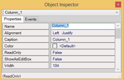
When ShowAsEditbox is set to 'true', the column will be shown/displayed as an editbox. The ReadOnly property will indicate if the editboxes of that column will be readonly or not, but when the property ShowAsEditbox is set to 'false', the fields will not be editable and the ReadOnly property will not have any effect.
| Please note: We recommend having at least 1 column with ShowEditBox set to false to be able to use the listview fully with it's properties. For example, when ShowEditBox is set to true, there is no color set when the user is in an editable field. As a result, if you use only ShowEditBoxes in a listview, it is hard to see in which row the user is active. |
Changing during runtime:
The ReadOnly property for the listview can also be edited at runtime.
The following example code creates a list where the slogan for Paris can not be changed by the user:
CitySlogansListView.items.add ()
CitySlogansListView.items[1].Text[1] := 'Netherlands'
CitySlogansListView.items[1].Text[2] := 'Amsterdam'
CitySlogansListView.items[1].Text[3] := 'Hallo Amsterdam'

CitySlogansListView.items.add ()
CitySlogansListView.items[2].Text[1] := 'France'
CitySlogansListView.items[2].Text[2] := 'Paris'
CitySlogansListView.items[2].Text[3] := 'Bonjour Paris'
CitySlogansListView.items[2].ReadOnly[3] := True

CitySlogansListView.items.add ()
CitySlogansListView.items[3].Text[1] := 'United Kingdom'
CitySlogansListView.items[3].Text[2] := 'London'
CitySlogansListView.items[3].Text[3] := 'Hello London'
In order to set an entire column to ReadOnly, you could use the following example:
CitySlogansListView.Columns[3].ReadOnly := TrueNavigation within the listview:
A user can leave the editbox with arrow keys up and down or Tab. When the user presses the Enter key within an editbox, this will result in a transmit of the form.
The taborder within an editable listview will be from top left to bottom right. When the last field is reached, the next Tab will navigate to the next input-field beyond the list view.
When the down-arrow key is pressed on the last editable field, the cursor will start in the first field of the current column.
A listview will keep the cursor within the same editbox when a "transmit" is executed.
| There is a difference in the non editable Listview tabbing behaviour between AMT Screens and the Web Client. In AMT Screens using the tab key when a row is selected will cause the focus to shift to the next object. In the web client using the tab key when a row is selected will select the next row in the Listview, when the last row has been reached the focus will shift to the next object. |
Properties:
- 3D
- Align
- AutoHeight
- CheckBoxes
- CheckBoxesEnabled
- Color
- ColumnItems
- Description
- Enabled
- Encrypted
- Font
- GridLines
- Height
- HelpText
- ImageList
- ItemHeight
- Left
- MultiSelect
- Name
- Parent
- Readonly
- ShowAsEditbox
- ShowItemImages
- SortOnColumnClick
- TabNumber
- TabStop
- Top
- Visible
- Width
- ZOrder
Dynamic code properties:
For the whole listview you can use the following dynamic properties:
- AutoHeight
- CheckBoxes
- CheckBoxesEnabled
- Color
- Enabled
- FontBold
- FontColor
- FontItalic
- FontName
- FontSize
- FontUnderline
- GridLines
- HelpText
- Left
- MultiSelect
- ShowItemImages
- SortOnColumnClick
- Top
- Visible
For Columns the following dynamic properties can be used:
- COLUMNS[<Column number>].Caption
- COLUMNS[<Column number>].Color
- COLUMNS[<Column number>].Readonly
- COLUMNS[<Column number>].Width
For Rows/Items the following dynamic properties can be used:
- ITEMS[<Item index number>].Checked
- ITEMS[<Item index number>].Color
- ITEMS[<Item index number>].Fontbold
- ITEMS[<Item index number>].Fontcolor
- ITEMS[<Item index number>].Fontitalic
- ITEMS[<Item index number>].Fontname
- ITEMS[<Item index number>].Fontsize
- ITEMS[<Item index number>].Fontunderline
- ITEMS[<Item index number>].Imageindex
- ITEMS[<Item index number>].Selected
For the Cells within a Row the following dynamic properties can be used:
- ITEMS[<Item index number>].Colors[<Column number>]
- ITEMS[<Item index number>].Fontsbold[<Column number>]
- ITEMS[<Item index number>].Fontscolor[<Column number>]
- ITEMS[<Item index number>].Fontsitalic[<Column number>]
- ITEMS[<Item index number>].Fontsname[<Column number>]
- ITEMS[<Item index number>].Fontssize[<Column number>]
- ITEMS[<Item index number>].Fontsunderline[<Column number>]
- ITEMS[<Item index number>].Readonly[<Column number>]
- ITEMS[<Item index number>].Text[<Column number>]
Events:
Functions:
- COLUMNS.COUNT()
- ITEMS.add()
- ITEMS.clear
- ITEMS.COUNT()
- ITEMS.Delete(<Item index number>)
- ITEMS.Insert(<Item index number>)
- ITEMS.Sort(<Sort order> <Column number>[, <Sort order> <Column number>[, ...]])
- SetFocus
Example:
Listview_1.ITEMS.DELETE(9)
// Deletes the 9th record from the listview "Listview_1".

listview_0.ITEMS.add()
// Adds an empty row

i := listview_0.ITEMS.COUNT ()
// Obtains number of rows in listview

listview_0.ITEMS[i].TEXT[1] := name
// Adds column 1 data

listview_0.ITEMS[i].TEXT[2] := continent
// Adds column 2 data

listview_0.ITEMS[i].IMAGEINDEX := imageindex
// Sets the imagelist for the listview