Combobox
Description:
Box item that presents the end user a list of items that can be selected.
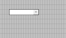 |
| A toolbox |
The filling of comboxes can be defined through the object inspector, through the code and/or, if the property "ReadOnly" is set to false for this item, manually by the end user.
If the combobox has focus, typing will trigger the auto-complete functionality which will select the first value that matches the typed characters. Multiple characters can be used for auto-completion when typing in rapid succession.
| For filling the Listbox with data please refer to the Filling Listboxes and Comboboxes help page. |
Toolbar button icon:

Properties:
- 3D
- Color
- Decimals
- Description
- DropDownCount
- DropDownListSize
- Dictionary
- Enabled
- Encrypted
- Font
- Height
- HelpText
- ItemsandValues
- ItemsDisplayed
- Left
- Length
- MemoryBased
- Name
- Numeric can be empty
- OccursData
- Parent
- ReadOnly
- ScrollHorz
- SearchMatch
- Selected
- Sorted
- Style
- TabNumber
- TabStop
- Top
- Type
- UpperCase
- ValidateEntry
- ValueSend
- Visible
- Width
- ZOrder
Events:
Dynamic properties:
- Color
- Enabled
- FontBold
- FontColor
- FontItalic
- FontName
- FontSize
- FontUnderline
- HelpText
- Items[<Item number>].Text
- Items[<Item number>].Value
- Left
- ReadOnly
- SetFocus
- Top
- Visible
Functions: