Layout Properties
| Property | Description | Set in | Value | |||||||||||||||
|
3D |
If set to true, the control is shown in 3D. |
Object inspector |
<Boolean> |
|||||||||||||||
|
Alignment |
Alignment for the text in the control. |
Object inspector |
<Left Justify | center justify | right justify> |
|||||||||||||||
|
AlsoSendOnTransmit |
(IBM CICS BMS Only) The screen copy wizard will add label objects to the screen copy depending on this property and the 'Caption' property. |
Object inspector | <Boolean> | |||||||||||||||
|
Alt Shortcuts |
If set to "True", "&" is automatically converted to a shortcut. When the user presses the ALT-shortcut, the cursor will be focused on the control that is defined with the property 'FocusControl'. |
Object inspector |
<Boolean> |
|||||||||||||||
|
BorderStyle |
Border style for the control to show. |
Object inspector |
<Single | underline | none> |
|||||||||||||||
|
Caption |
Text to appear in the control. By adding an ampersand (&) before a character, that specific character will be marked as a shortcut character. At runtime, the concerned character will then appear underlined. Subsequently, the end user can invoke the shortcut functionality through the keyboard combination Alt + <Underlined character>. If the concerned shortcut belongs to a label, it will shift the focus to the control that is defined through the property focuscontrol. |
Object inspector |
<Text> |
|||||||||||||||
|
CharWidth |
Determines the space per character. This property does not change the character presentation, which means that characters are not stretched when choosing a higher property value. |
Object inspector |
<Numeric> |
|||||||||||||||
|
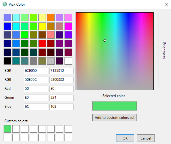
Color |
Background color to give to the control. This property can also be set for a whole form layout (including all available layout controls) at once. When <default> is chosen in the object inspector the color of the Parent layout control will be used. In the object inspector it is also possible to open a colour picker window to select a custom colour by clicking on the "..." button to the right of the dropdown menu.
By adding a colour to the custom colors set, multiple custom colours can be quickly selected. |
Object inspector |
<Numeric> |
|||||||||||||||
|
ColorEdit |
Background color for the edit fields that are shown through the dynamic form which are not blinked or disabled. |
Object inspector |
<Numeric> |
|||||||||||||||
|
ColorEditBlink |
Background color for the blinked edit fields that are shown through the dynamic form. |
Object inspector |
<Numeric> |
|||||||||||||||
|
ColorEditDisabled |
Background color for the disabled edit fields that are shown through the dynamic form. |
Object inspector |
<Numeric> |
|||||||||||||||
|
ColorEditFont |
Font color for the edit items that are shown through the dynamic form. |
Object inspector |
<Numeric> |
|||||||||||||||
|
ColorEditReverse |
Background color for the edit items that are reversed. |
Object inspector |
<Numeric> |
|||||||||||||||
|
ColorLabelBlink |
Color for the blinked label items that are shown through the dynamic form. |
Object inspector |
<Numeric> |
|||||||||||||||
|
ColorLabelFont |
Color for the non-blinked label items that are shown through the dynamic form. |
Object inspector |
<Numeric> |
|||||||||||||||
|
ColorLabelReverse |
Color for the label items that are reversed. |
Object inspector |
<Numeric> |
|||||||||||||||
|
Columns |
The number of columns for the dynamic form. This value determines the width of the dynamic form. |
Object inspector |
<Numeric> |
|||||||||||||||
|
DecimalChar |
Character that is used as separator in decimal values. |
Object inspector |
<Default | period | comma> |
|||||||||||||||
|
Decimals |
Number of decimal characters to assign to the control value. |
Object inspector |
<Integer> |
|||||||||||||||
|
Description |
Description of the control. |
Object inspector |
<Text> |
|||||||||||||||
|
Enabled |
Boolean value that indicates if the control or (sub) item is enabled. If set to "False", the control or item will be greyed out and disabled at runtime. |
Object inspector |
<Boolean> |
|||||||||||||||
|
Encrypted |
The Encrypted property of a specific control item or element. If set the transmission of data between the Application Server and the Web Client will be encrypted. |
Object inspector | <Boolean> | |||||||||||||||
|
FocusControl |
Name of the control that must be focussed when the user presses the ALT-Shortcut combination (according to the shortcut setting in the caption definition of the label). This setting only works at runtime if the property "Alt Shortcuts" is set to TRUE. |
Object inspector |
<String> |
|||||||||||||||
|
Font |
Name, style, size, effects, color and script for the font used in the control or the form. This property can also be set for a whole form layout (including the available layout controls) at once. warning The fonts to choose from are the available fonts of the client machine the AMT Developer Studio is running on. When a chosen font is not available on the client machine AMT Screens is running on (for Reports the server the batch controller is running on and for the webclient the client machine the webbrowser is running on) the Windows default font of that client/server will be used. If that replacement font is wider then your desired font, field sizes will be expanded to fit. To add fonts, right-click on the font file and select the 'Install for all users' option under 'Show more options'. This will ensure that all AMT components will have access to the font. By clicking on the "..." button to the right of the colour dropdown menu, a colour picker window is opened where it is possible to select a custom colour. For more information, see the color property. |
Object inspector |
Values are chosen from the 'font box' that is called by clicking the button that is displayed on the right of the fontproperty in the object inspector. |
|||||||||||||||
|
ForceDecimalKey |
If set to true, then values that are specified in the layout control will be rejected if they don't contain the decimal character. If set to false, the decimals may be omitted. If set to default, this option will work according to the global setting. |
Object inspector |
<Default | true | false | none> |
|||||||||||||||
|
Format |
Specification of how variables are to be translated to alpha fields. See Layout Property Format. |
Object inspector |
<Format specification> |
|||||||||||||||
| GroupName |
(IBM CICS BMS Only) |
Object inspector | <String> | |||||||||||||||
|
Height |
Height of the control or form. The height of the object can only be set to a number from 1 to the Maximum Height. |
Object inspector |
<Integer> |
|||||||||||||||
|
HelpText |
Text to appear as a hint for the control that is displayed on the cursors position. |
Object inspector |
<String> |
|||||||||||||||
|
HyperColor |
Color to be used for hyperlinks. This property applies to all layout controls that are available on a form. |
Object inspector |
<Numeric> |
|||||||||||||||
|
HyperLink |
Specification of the web address to be opened when the end user clicks on the layout control. The hyperlink value may refer to a URL with either a http:// or a https:// prefix. |
Object inspector |
<URL> |
|||||||||||||||
| IbmFieldset |
(IBM CICS BMS Only) |
Object inspector | <Boolean> | |||||||||||||||
| InitialText |
Default text/value that is assigned to a memo control. |
Object inspector | <String> | |||||||||||||||
|
InitialValue |
Default value that is assigned to the control. |
Object inspector | <String> | |||||||||||||||
|
Intensified |
(IBM CICS BMS Only)
Please note that if the protected attribute is set on an editbox, an additional class is also used to change the appearance of this field, namely .CIbmCobolTextBoxProtected. |
Object inspector | <Boolean> | |||||||||||||||
|
ItemsValuesImages |
Settings for each separate element in a buttongroup. The following settings apply:
One button is defined as default. When referring to the value in your code, please be aware that this value is CASE SENSITIVE. |
Object inspector |
See description. |
|||||||||||||||
|
Layout |
If set to Horizontal, the itemgroup is shown as a row. With all the items sized equally. |
Object inspector |
<Horizontal | Horizontal auto scale | Vertical> |
|||||||||||||||
|
Left |
Number of pixels space before the control. If the control is related to a parent, then the number of space is measured from the beginning (left) of the parent until the beginning of the control. Otherwise, the space is measured from the beginning of the form or report. |
Object inspector |
<Integer> |
|||||||||||||||
|
Length |
Maximal number of characters to give to the control value(s). |
Object inspector |
<Integer> |
|||||||||||||||
| LetterSpacing | The spacing between characters in pixels for the web client only. Can be set from -2.0 to 2.0 or on 'Default'. When both this form layout option and the application option 'Letter spacing (px)' are set to default, the 'letter-spacing' value stored in the Amt.css file of the application web theme will be used. By default this setting is omitted for most layout components in the Amt.css file which has the same effect as setting letter-spacing to normal. The priority for letter spacing is: 1. Form layout option. 2. Application option. 3. Amt.css file 'letter-spacing' property in the used application web theme. When label values are truncated in the web, can you change either the Amt.css for all forms per application web theme, the application option 'Letter spacing (px)' for all forms in all web themes, or overwrite the value per form by using this letter spacing layout option. Sometimes you need a value of -0.2 or -0.4 to get the same alignment between the web client in a browser and AMT Developer Studio/AMT Screens. |
Object inspector | <Numeric> | |||||||||||||||
|
LineHeight |
The height of a single line (in number of pixels). |
Object inspector |
<Numeric> |
|||||||||||||||
|
Name |
Name of the control. |
Object inspector |
<Text> |
|||||||||||||||
|
Numeric can be empty |
When set to true the value of the Numeric may also be all spaces, otherwise only digits are allowed. |
Object inspector |
<Boolean> |
|||||||||||||||
|
Numeric input |
Only for objects set to Type Alpha. |
Object inspector |
<Boolean> |
|||||||||||||||
|
OccursData |
Occurrence settings for the layout control. The settings for the vertical occurs determine the number of control elements that appear under each other and the offset (number of pixels space) between these elements. If in a screen layout, the Form Offset option is selected, the offset will be set to the value that is specified for the form properties OccursOffsetHorz and OccursOffsetVert. |
Object inspector |
<Text> |
|||||||||||||||
|
OccursOffsetHorz |
The offset (in number of pixels) between control elements that are grouped horizontally. This option applies to all controls on the form that have the Form Offset option for the horizontal occurs selected. |
Object inspector |
<Integer> |
|||||||||||||||
|
OccursOffsetVert |
The offset (in number of pixels) between control elements that are grouped vertically. This option applies to all controls on the form that have the Form Offset option for the vertical occurs selected. |
Object inspector |
<Integer> |
|||||||||||||||
|
Pages |
The number of pages to be included in the dynamic form. Every new page may be regarded as the follow up for the previous page. Through the code, control characters are used for pointing to a specific page (the same as for the Terminal screens, on which the Dynamic Forms functionality is based). |
Object inspector |
<Numeric> |
|||||||||||||||
|
Parent |
Control to which one or more child controls are related to. |
Object inspector |
<String> |
|||||||||||||||
|
Password |
If set to "True", the user input will be displayed as asterisks (*) within the control. |
Object inspector |
<Boolean> |
|||||||||||||||
|
ReadOnly |
If set to "True", endusers are not allowed to write to the control or change the color of the text that is displayed in the layout control. If set as false, users have both read and write permission. |
Object inspector |
<Boolean> |
|||||||||||||||
|
Rows |
The number of rows that is presented on a dynamic form, not including the StatusLine. |
Object inspector |
<Numeric> |
|||||||||||||||
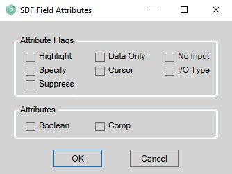
|
SdfAttributes |
(A-Series SDF Only)
|
Object inspector | See description. | |||||||||||||||
|
ShowBorder |
Determines whether or not there must be displayed a border around the layout control. |
Object inspector |
<Boolean> |
|||||||||||||||
|
ShowLeadingZeros |
The number of leading zeros to be displayed or printed (depending on the kind of layout includes the layout control). |
Object inspector |
<None | one | all | all except 0> |
|||||||||||||||
|
StatusLine |
If set to "true", the dynamic form is enlarged with an additional status line that is shown below each page of the dynamic form. Through the code, control characters are used for pointing to the status line. This property is used in the conversion of terminal screens that use dynamic delimiters. |
Object inspector |
<Boolean> |
|||||||||||||||
|
TabNumber |
Number that is given to different controls to assign the order to move the cursor from one control to the next when the user hits the TAB key. The tabnumber value for layout controls can be reset instantly to a value based on the screen position or the position within a specific group. This can be done through a right mouse click on the layout screen (while selecting a specific group or selecting no layout control at all), selecting the option "Taborder" and then choosing "Auto tab". The tabnumber value for the control on the top left of the screen or the concerned group will then be reset to "0". The order will then in first instance be determined based on the horizontal position and then on the vertical position. The highest value will be assigned to the item on the bottom right. Another option to make sure that the screen will be tabbed through from the top left to the bottom right can be found in the form options. By selecting the switch "Calculate taborder based on left-top", you make sure that the layout controls are always tabbed through according to their screen position. The tabnumber property will then be overruled. Please note that controls for which the Tabstop property has been set to FALSE are always excluded from tabbing. |
Object inspector |
<Numeric> |
|||||||||||||||
|
TabStop |
When tabbing through the layout at runtime and this property is to "False", the cursor will not be put in the concerned control. |
Object inspector |
<Boolean> |
|||||||||||||||
|
ThousandSeparator |
Separator that is displayed in numeric values between every three digits counted from the right. |
Object inspector |
<Default | period | comma | apostrophe | none> |
|||||||||||||||
|
Title |
Text to display on top of the control. |
Object inspector |
<Text> |
|||||||||||||||
|
Top |
Position where the control is painted or printed. If the control is related to a parent, the value indicates the number of pixels between the top position of the control and the top position its parent. Otherwise, the value indicates the number of pixels between the top of the control and the top of the form or report. |
Object inspector |
<Integer> |
|||||||||||||||
|
Type |
Valid type for the control. |
Object inspector |
(Types that have a fixed length) (types that don't have a fixed length) |
|||||||||||||||
|
Transparent |
If set to True, only the text of the control will be displayed. The background will be completely transparent. |
Object inspector |
<Boolean> |
|||||||||||||||
|
UnderlineWholeField |
Applies to all layout controls on the applicable form for which the Underline property is set for the Font. Only if "Underline whole field" is set to "True", the underline applies for the whole length of the control. Otherwise, only the text that is displayed in the field will be underlined. |
Object inspector |
<Boolean> |
|||||||||||||||
|
UpperCase |
If set as "True", the value will be converted to UPPERCASE. |
Object inspector |
<Boolean> |
|||||||||||||||
|
Visible |
If set "False", then the control will not be shown at runtime. |
Object inspector |
<Boolean> |
|||||||||||||||
|
Width |
Horizontal size of the control or form. The width of the object can only be set to a number from 1 to the Maximum Width. |
Object inspector |
<Integer> |
|||||||||||||||
|
WordWrap |
If set to true, the text that is printed or displayed in the control wraps when the right margin is reached. The text continues at the next line. |
Object inspector |
<Boolean> |
|||||||||||||||
|
WSOrder |
(A-Series SDF Only) |
Object inspector |
<Integer> | |||||||||||||||
|
ZOrder |
Controls the order of visual objects to display one object over another. For example, changing the ZOrder of a visual object to 1 will display that object over another that is set to 0. Negative numbers are accepted. The ZOrder is translated to a Z-Index value by increasing it with 1000 to avoid issues in the Web Client, this number can be adjusted by setting the generation switch ZORDERINCREMENT. |
Object inspector |
<Integer> |